Vflex
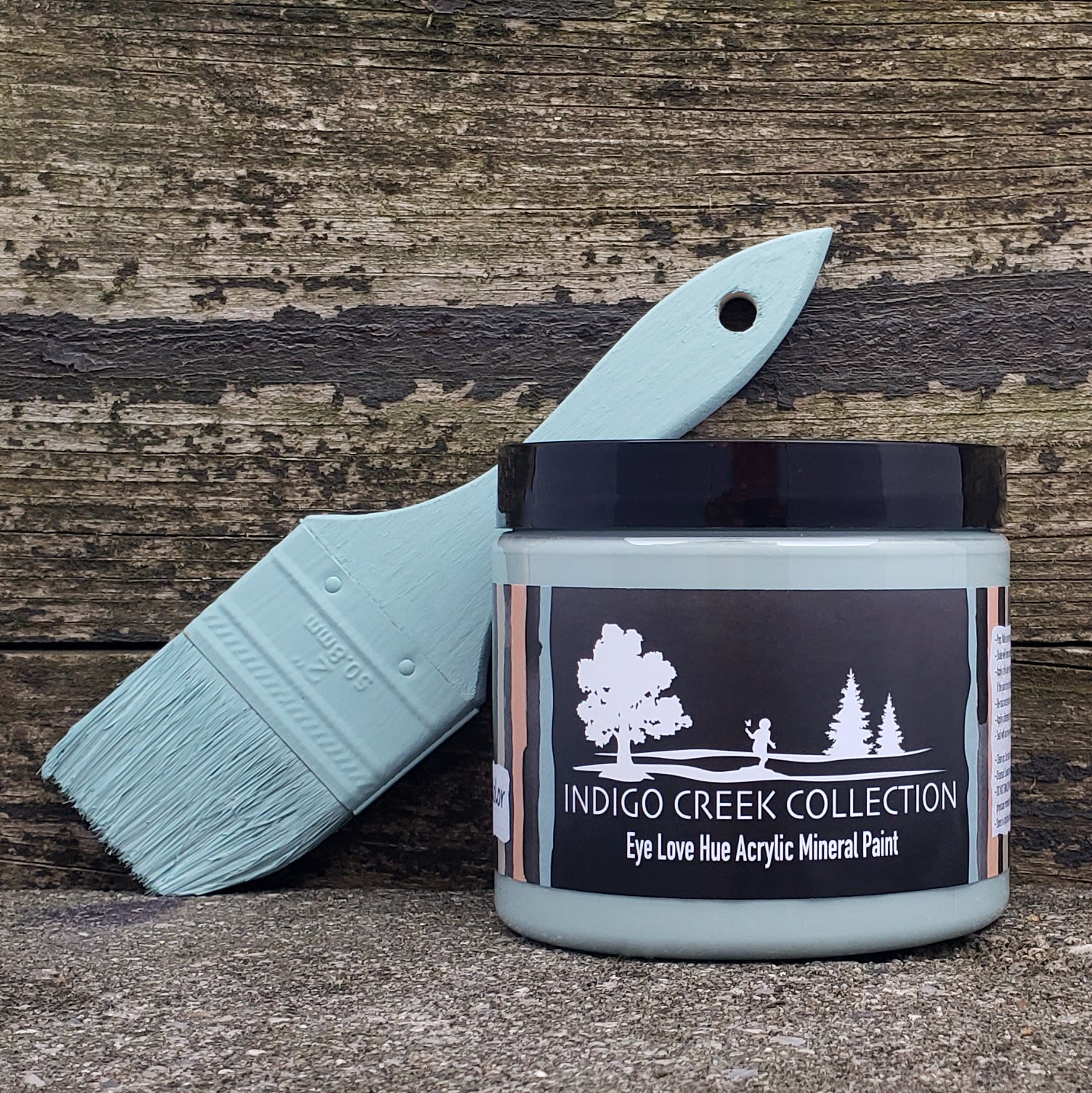
Eye Love Hue - Indigo Creek Collection
Eye Love Hue - Indigo Creek Collection
Couldn't load pickup availability
The Indigo Creek Studios Collection coming to life is just beyond my wildest dreams! I'm Jenna, the owner and creative that thrives on upcycling forgotten pieces of furniture. Nature has always been a driving inspiration and force in my life. When given the chance of a lifetime to create 6 unique colors; of course, nature and all of her gifts of beauty were at the center. Our young son Finnegan has adopted a similar lust for the outdoors that we, fortunately, get the chance to share together. From stomping in creeks, strolls through the woods, and wonders along the beach; Finn is the muse I never knew was missing. Kelly has made our family's love of simply being outside come to life.
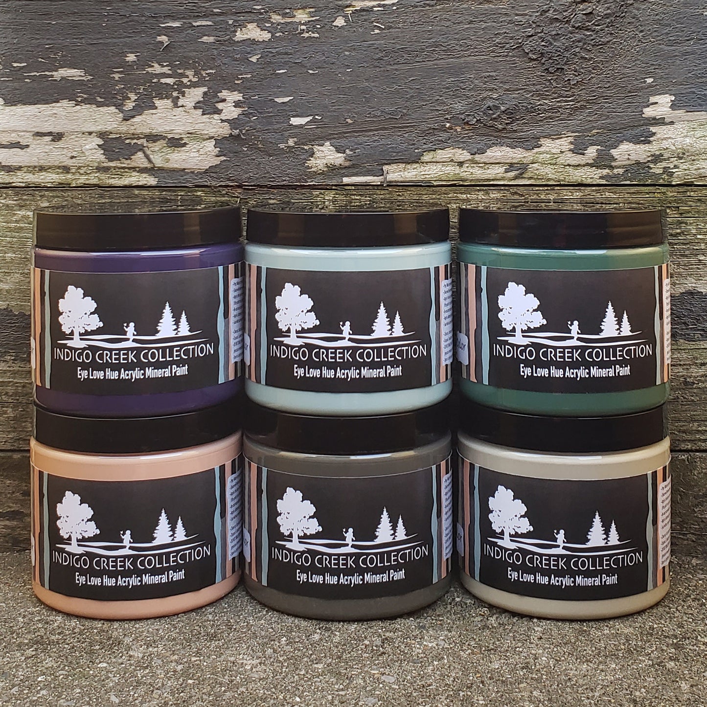
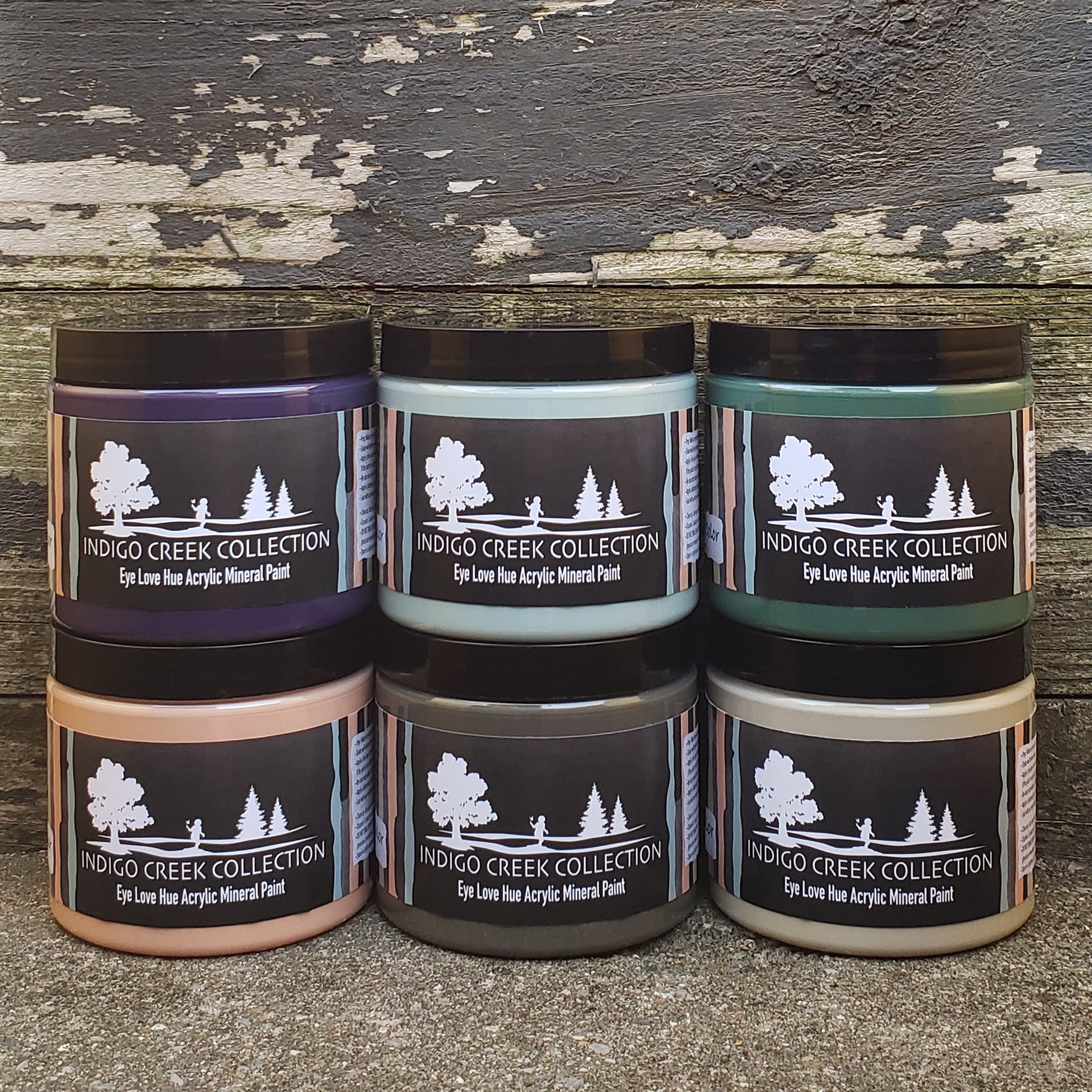
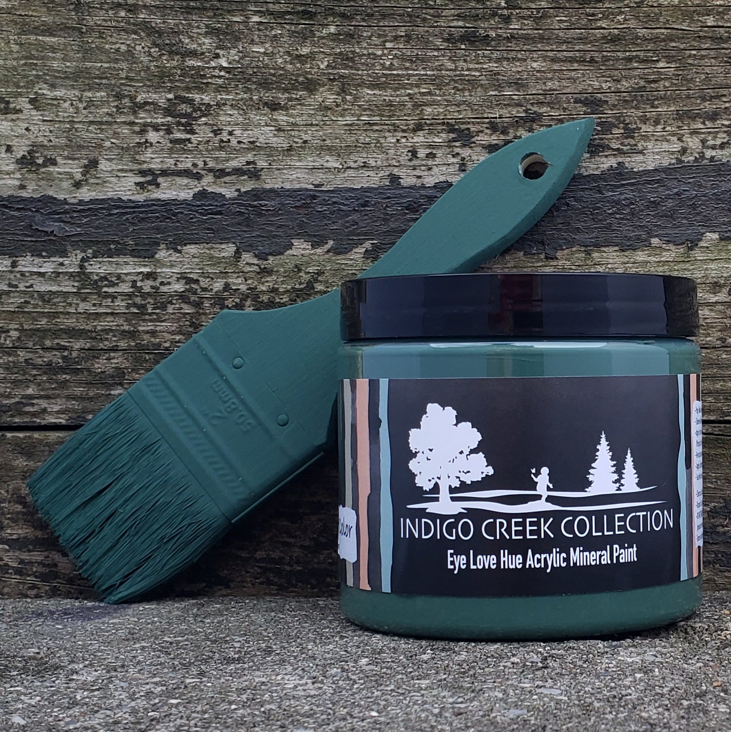
Eye Love Hue Paint is a rich creamy acrylic mineral paint that is perfect to transform furniture pieces and home decor items. The coverage of a 16 oz jar of acrylic mineral paint will depend on several factors, including the surface being painted, the thickness of the coat, and the application method. As a general rule of thumb, a 16 oz jar of acrylic mineral paint can cover approximately 64 to 80 square feet of surface area with a single coat.
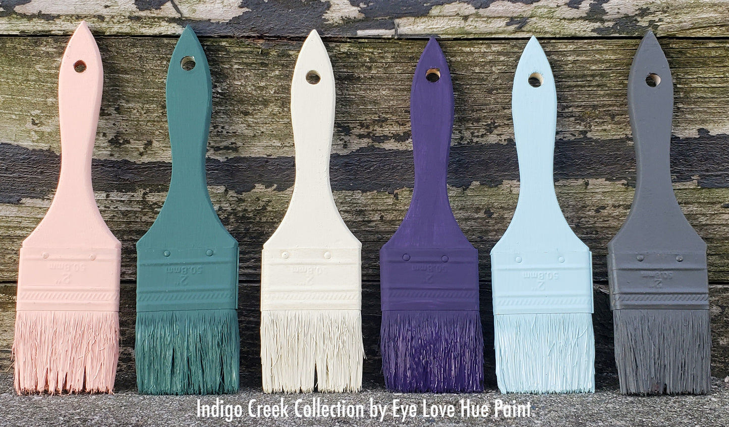
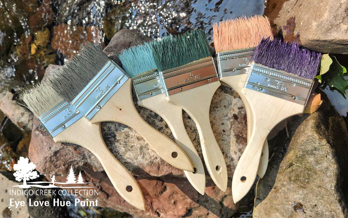
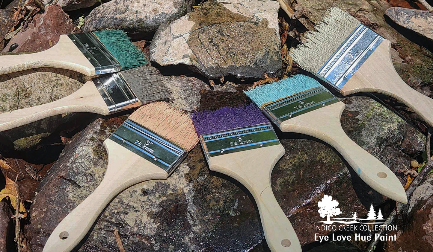
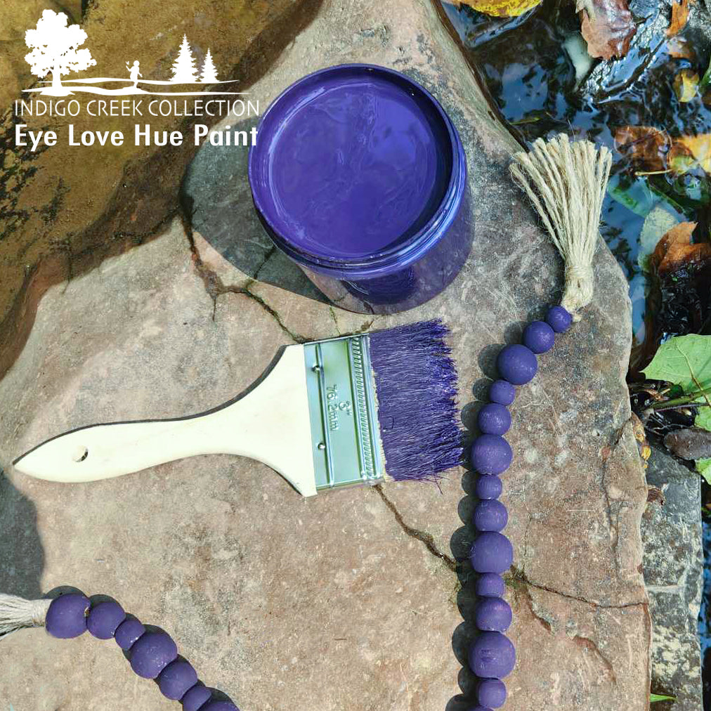
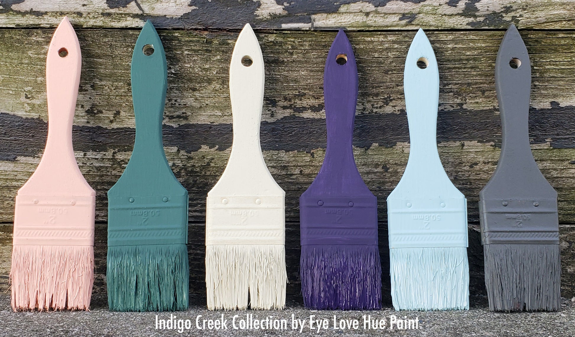
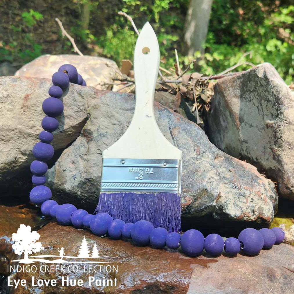
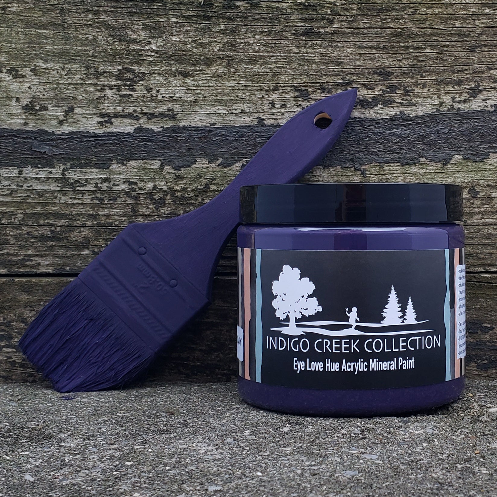
Indigo Spirit ~ The color indigo is one of the most valuable and ancient colors in history. It was a dark blue dye created from the "peas" of certain tropical plants. That blue combined with a deep hint of purple has calming effects on the mind and nerves. These deep and vibrant hues are also believed to be uplifting and represent intuition and creativity. Raising a young son who has an incredible spirit and connection to emotions; this hue we've created signifies inspiration.
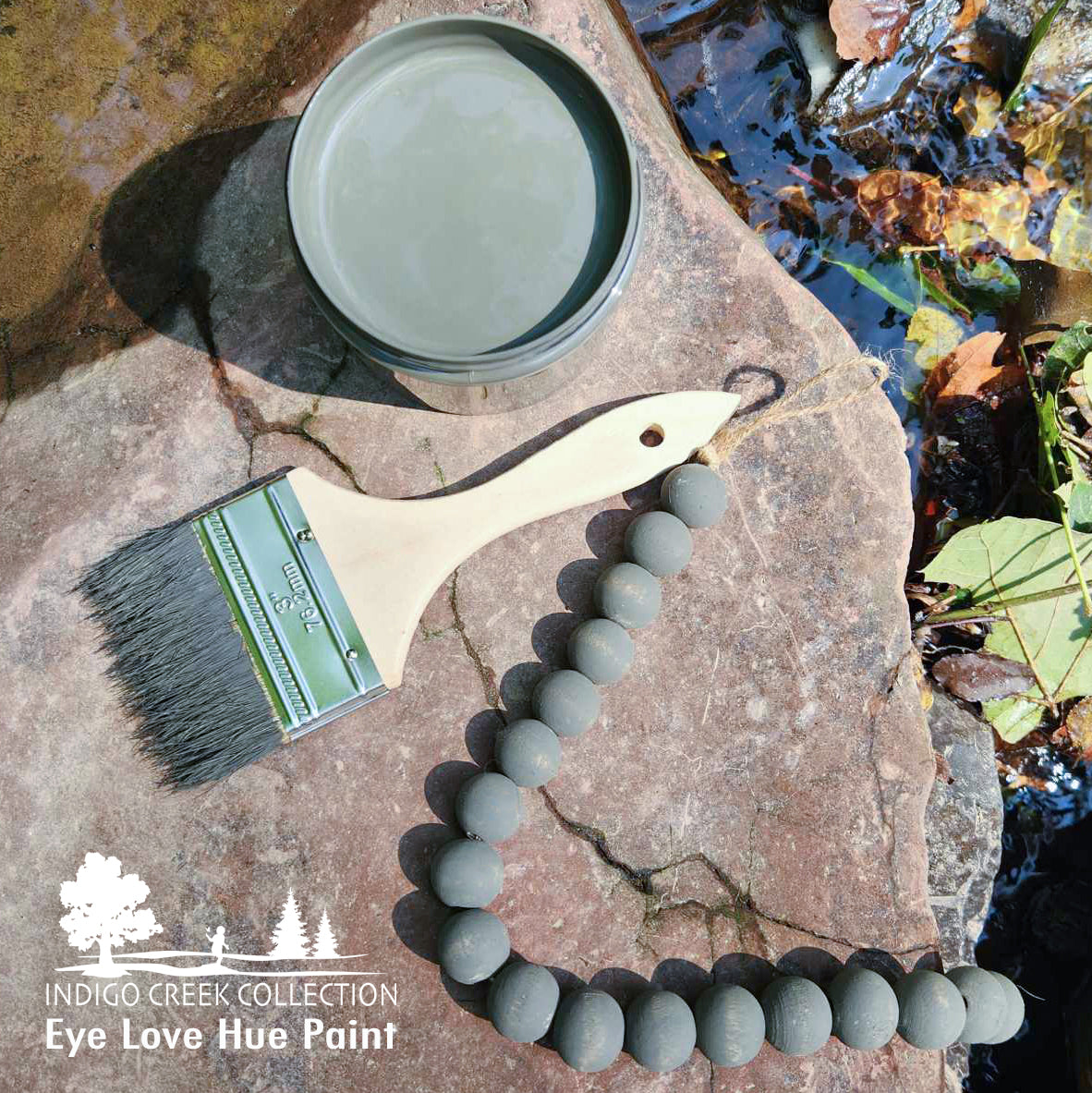
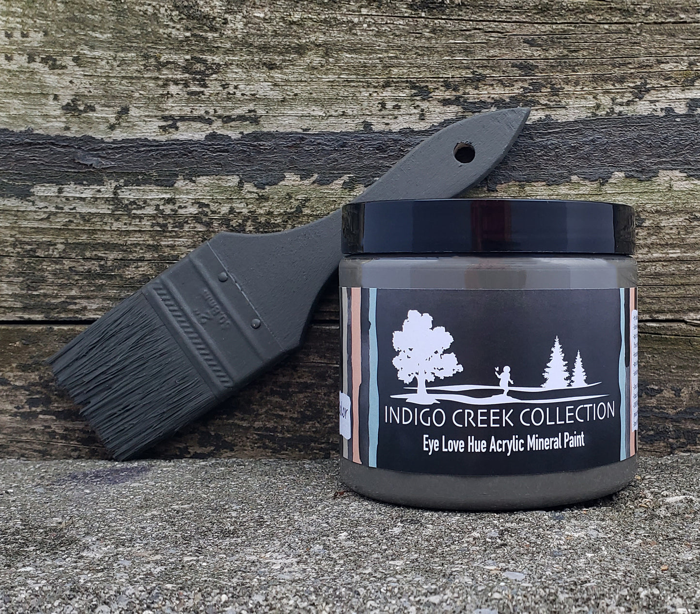
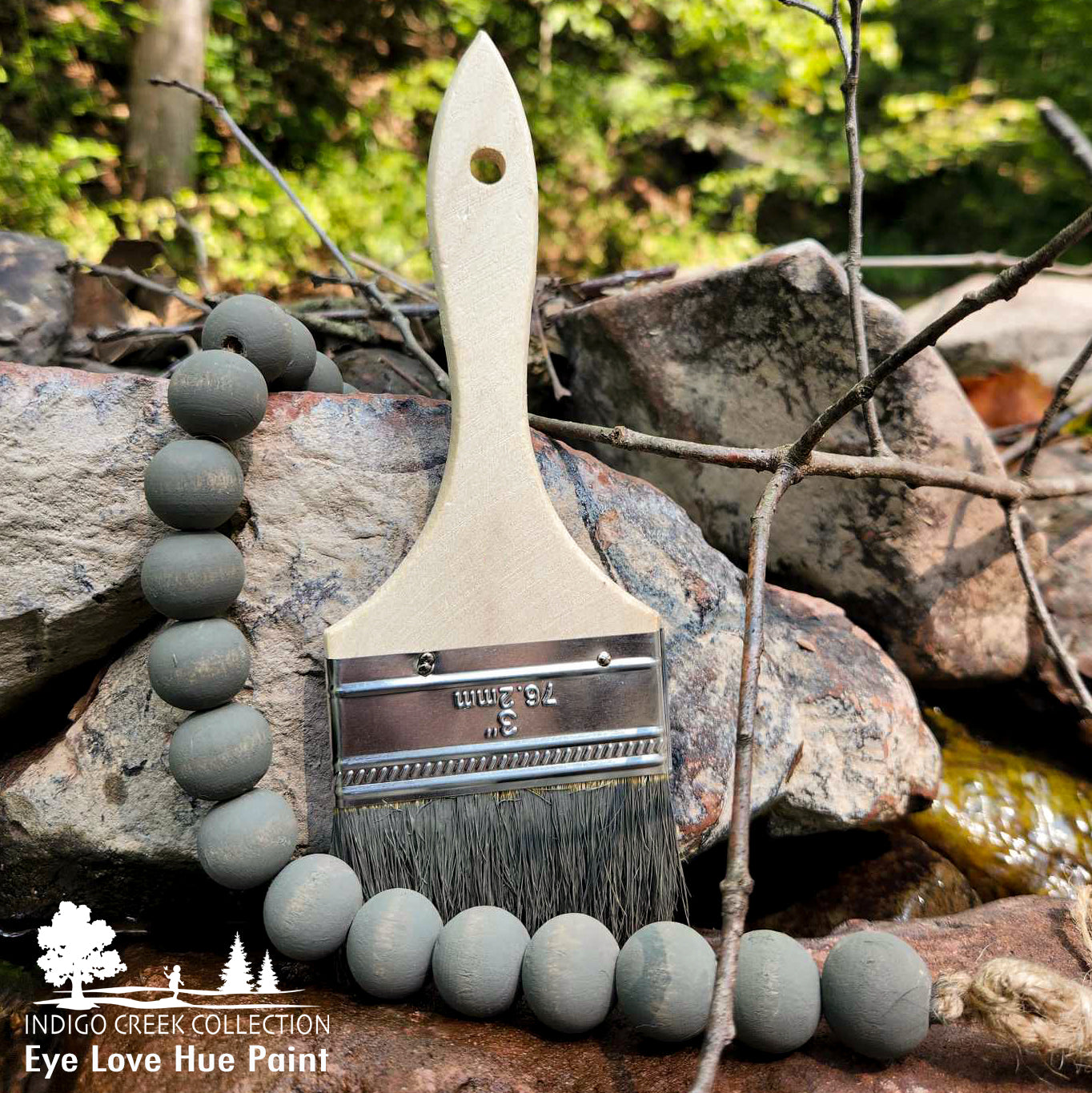
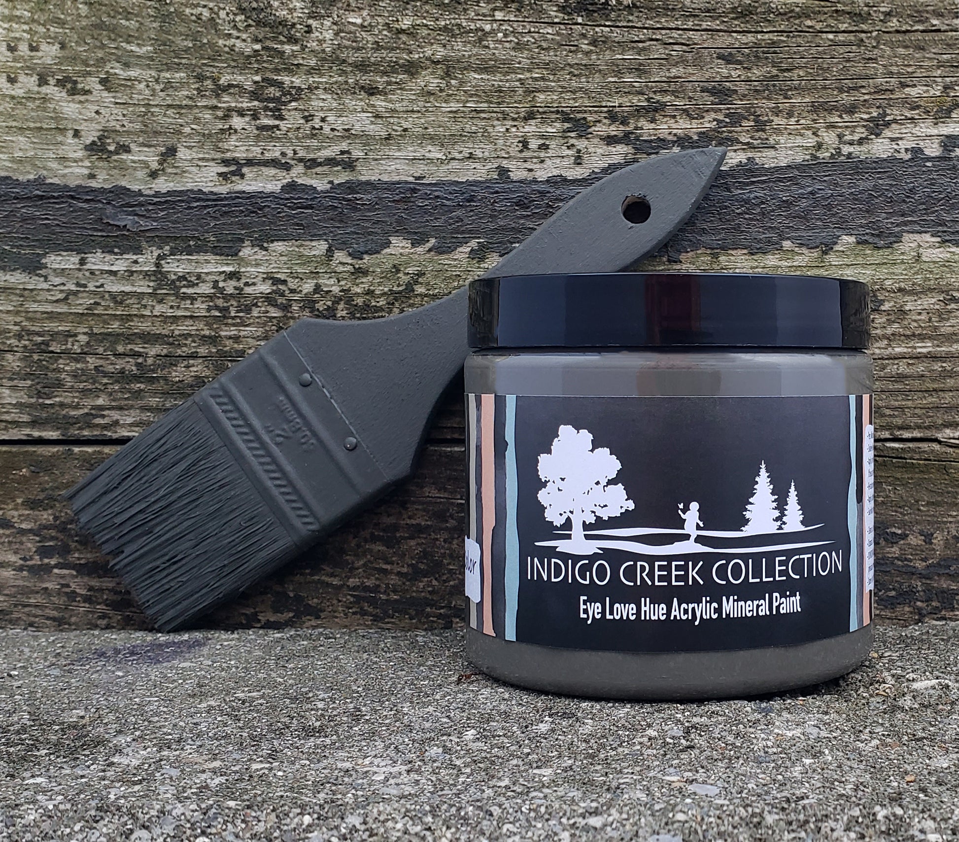
Stoney Creek ~ This deep, gray-green, was created to represent the shadowy parts of the running creek bottom that gets very little sunshine. It's a color from the Indigo Creek Collection that is both traditional and natural as well as quite sophisticated. Stoney Creek partners very well with other earth tones and compliments both cool and warm hues.
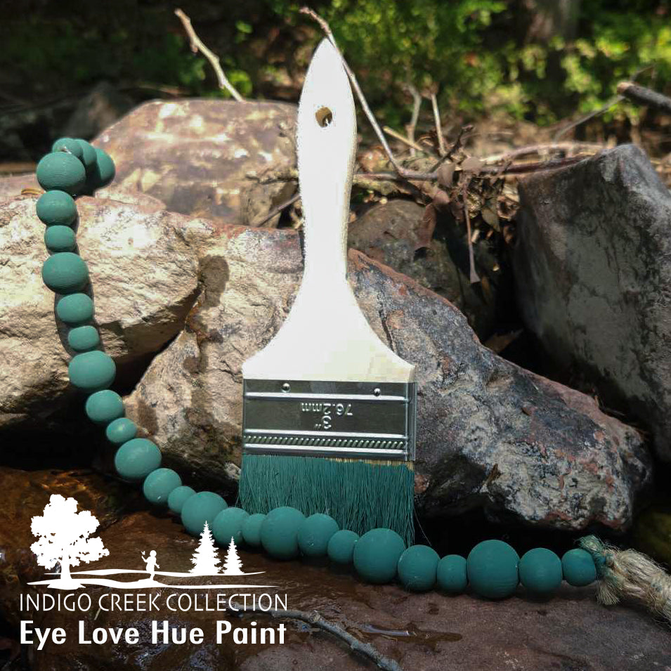
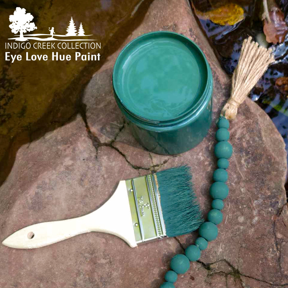
Happy Trees ~ A deeper hunter green with hints of cyan hues. Deep greens represent rebirth, new life, and Bob Ross for our family. I grew up watching The Joy of Painting and our son started watching him when he was 2 years old. This green feels like the green I would reach for if painting "happy little trees."
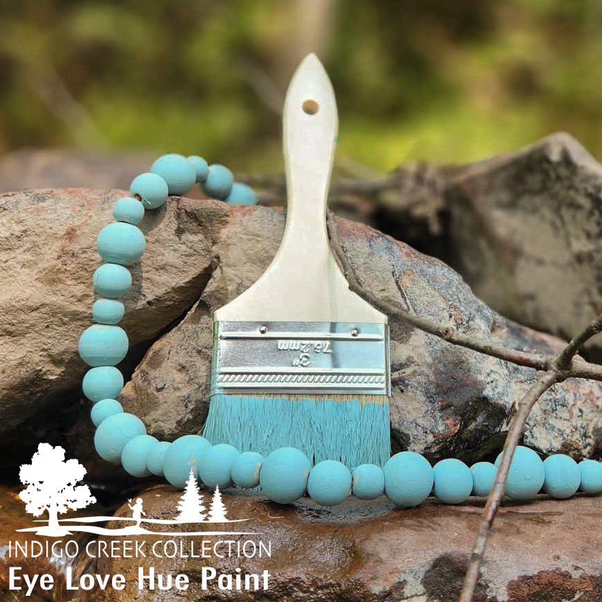
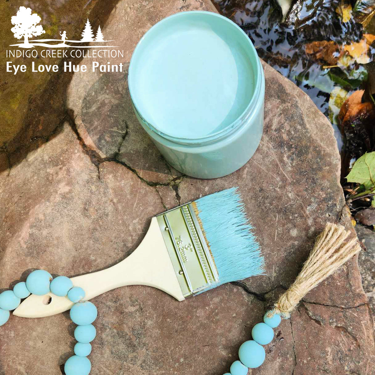
Sea Glass ~ It can take decades for the ocean, sand, and other elements to create sea glass. Dark and light colored aqua glass was the most widely used glass prior to the 1920s. The glass-making recipe contained a naturally occurring iron content that causes the tint of aqua. This soft blue paint color with a faint green undertone is the first color I think of when thinking of sea glass.
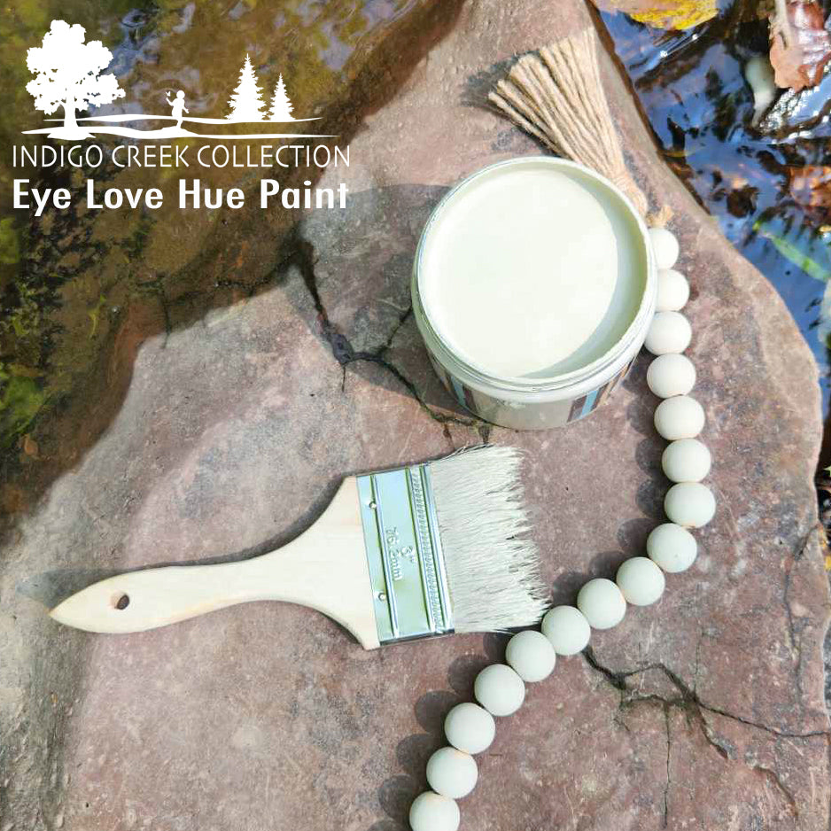
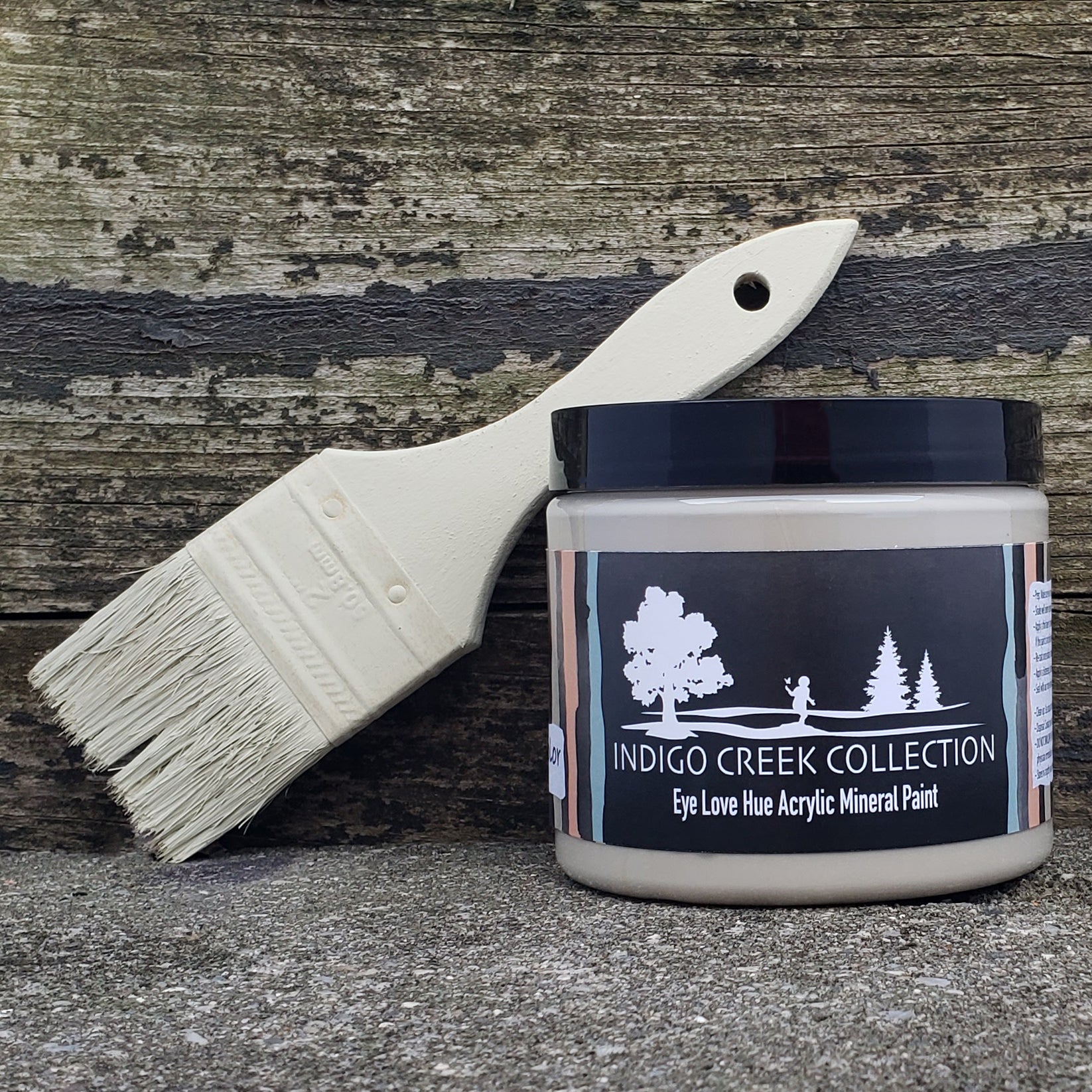
Huck & Finn ~ Is a warm taupe or dusty beige with a comfy and natural warm undertone. It's a color that feels like an early morning stroll through the dewy grass. Or even feels like those white linens that have a "lived-in" tint that you secretly are perfectly fine with accepting. The Huck & Finn color is inspired by the sweetest little boy and his dog duo I know; Finnegan and Hucklebuddy. It's easily a color that satisfies the neutral desires but has that little something you just can't put your finger on.
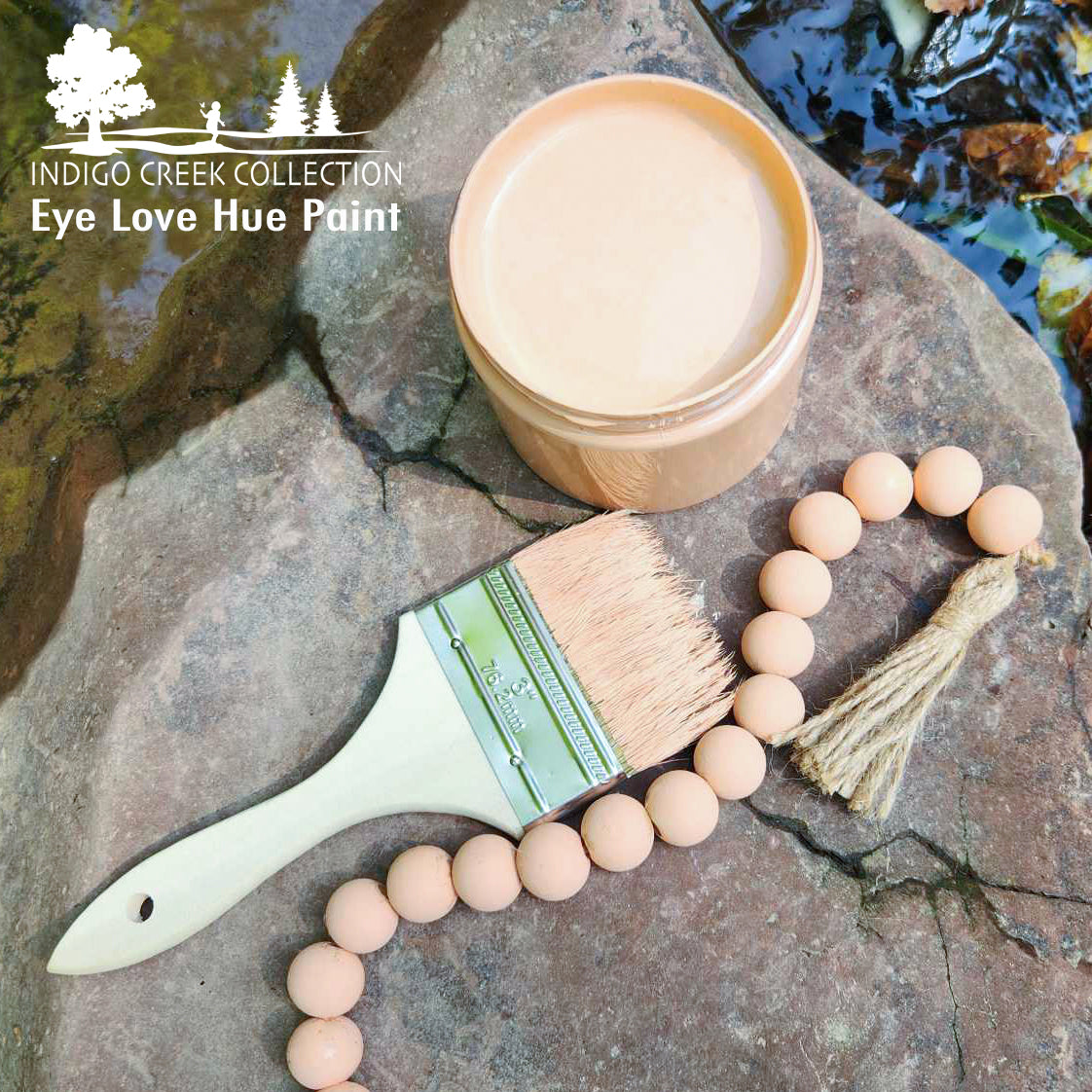
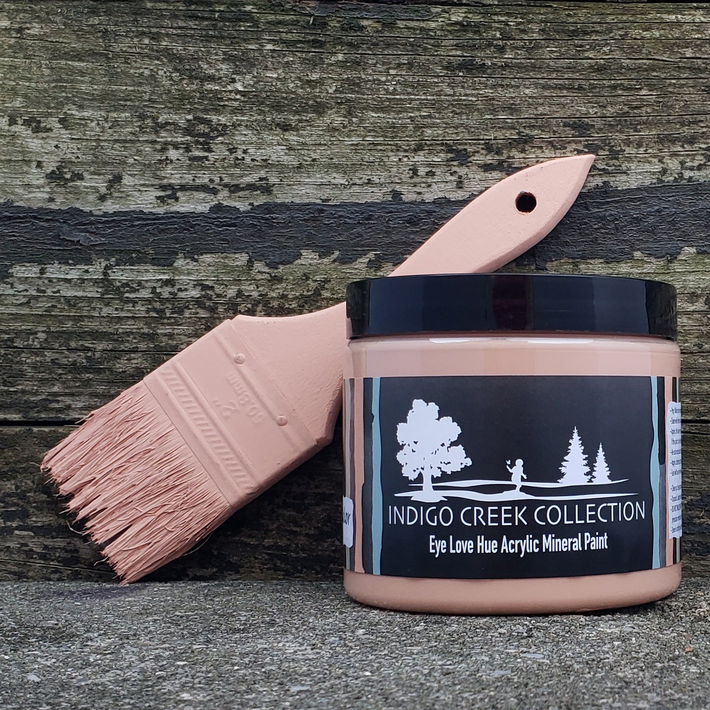
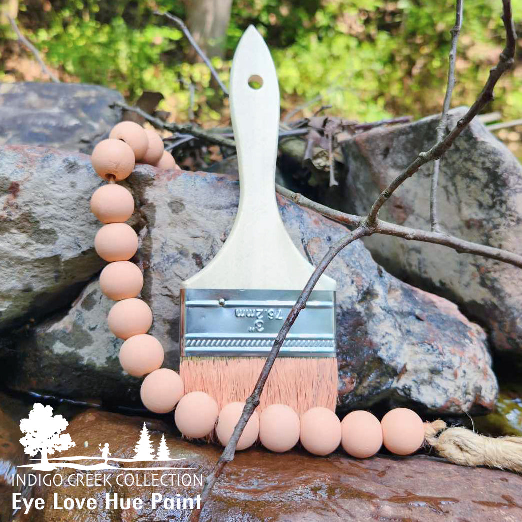
Barefoot ~ is a unique marriage between a floral bloom hue with a soft hint of sea coral. It is full of warm hints and undertones. Barefoot was created while exploring the mutualism between the peony plants and ants in our own backyard. The color is naked and feels like a smile at the beginning of spring as nature starts to wake up from winter.
